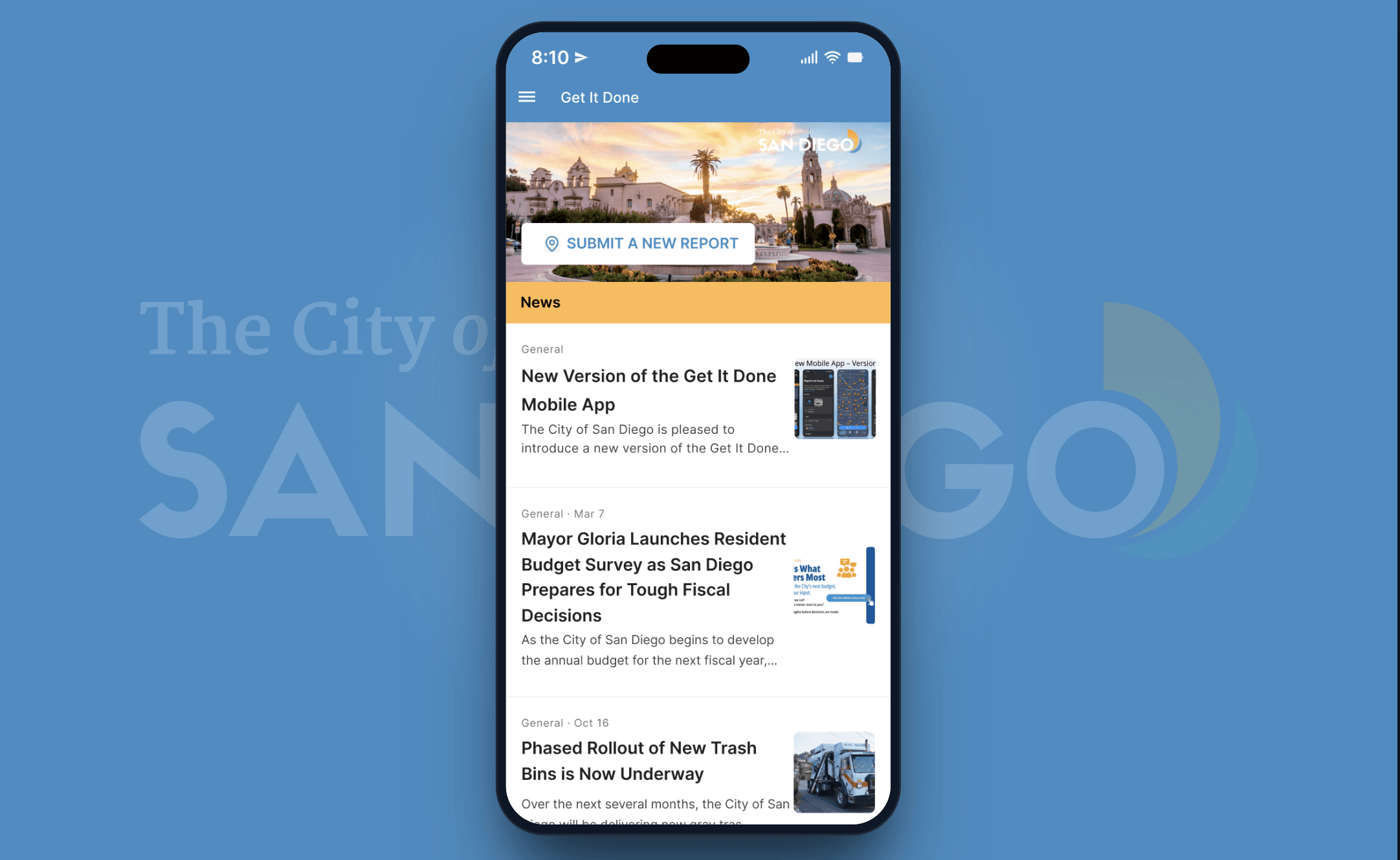
Get It Done, For The Rest Of Us
Extending San Diego's civic reporting app to the students who walk past the potholes every morning.
Overview
San Diego has an app called Get It Done. You take a photo of a pothole, broken streetlight, or pile of illegal dumping, the city receives the report, and someone eventually fixes it. Since 2016, it has received around 3.5 million service requests.
The app also requires anyone aged 13 to 17 to have an adult agree to its terms of service before they can use it. That seemed like a strange decision to me, because the group most likely to notice a broken bus stop on the way to school is the same group that has to ask a parent for permission before reporting it.
Our team thought that was worth looking into.
- Ashley Padilla
- Jonathan Ty
- Julie Nguyen
- Ruth Mazariego Lemus
COGS 127, Spring 2026.
I didn't pick this project because I had strong feelings about civic technology. I picked it because I've lived in San Diego long enough to walk past the same pothole on the same block for two years, and at some point I just stopped noticing it. I think most people who live here have a version of that story. The broken thing stops registering after a while, and you start to assume the street has always looked that way.
When we started looking into Get It Done, the demographic gap was interesting to me. There are roughly 205,000 residents aged 10 to 14 in San Diego County, and the app's terms more or less tell them to come back when they're older. At the same time, the Mid City CAN Youth Council recently helped secure $4.25 million to renovate a park in City Heights by showing up to council meetings in person. So it isn't that teenagers can't have an impact. The issue is that the digital infrastructure for it doesn't include them.
The current version of Get It Done, available on iOS and Android, works. You can submit a photo, drop a pin, choose a category, and track your request. It added a Spanish version in 2021, which felt like a meaningful step toward reaching more of the city. The core product is solid. The reach is the issue.
Problem Statement
Middle and high school students in San Diego walk past potholes, broken streetlights, and illegal dumping every day — and almost none of them report what they see. It isn't that they don't care. Most have simply decided that nothing would come of it.
This wasn't obvious going into the research. The assumption I started with was that teenagers didn't know how to report problems, or that the process was too inconvenient. What the interviews revealed was different: the students we talked to were observant, aware of their surroundings, and in several cases genuinely bothered by what they saw. The barrier wasn't the form. It was the belief that a sixteen-year-old's report wouldn't lead anywhere — and in the absence of any evidence to the contrary, that belief was completely rational.
User Research
Our team interviewed six high school students, most of them at Sweetwater High School. They were seniors or close to it, and all of them lived in neighborhoods where the broken streetlight problem was a real thing rather than a hypothetical one. I personally ran two of these interviews, with Carlie and Kriselda.
Going into the interviews, I expected to hear that teenagers wanted to report things and just didn't know how. That ended up being part of the story, but not the whole story.
None of the six interviewees had heard of Get It Done before we showed it to them. I expected that.
What I didn't expect was how much they noticed. Every single person I talked to could list off problems in their neighborhood without thinking about it. Carlie went through graffiti on murals, homeless encampments, broken street signs, and dysfunctional streetlights in maybe ten seconds. Kriselda talked about potholes on her drive home and litter "all over the place." These weren't kids who were unaware of their surroundings. They were paying attention.
What they didn't do was report any of it. The reasons were different from person to person, but they pointed in a similar direction. Carlie said the issues had been around long enough that they'd become normalized, and that she only really felt the need to report something if it was dramatic or in-your-face. Kriselda actually wanted to report things, but she didn't know who to contact for which kind of issue, and she also mentioned a quieter thing that I've kept thinking about. She said she was sometimes hesitant to report things because she didn't know what the consequences might be of "bringing up issues to people in power." That isn't a UI problem. That's a trust problem, and it's harder to design around.
I went into the interviews assuming the design problem was mostly discoverability. The thinking was something like: show kids the app, the app is fine, they'll use it.
By the third or fourth interview I had to let that go. The students who didn't know about the app still wouldn't use it after we explained what it did. A couple of them said pretty directly that teenagers don't really care about issues in their neighborhood, which I found interesting because the same students had just spent five minutes describing those exact issues to me. So they cared. They just didn't believe reporting would do anything.
That reframed the problem for me. It isn't a discoverability problem, and it isn't even really a usability problem. The app is usable. Carlie told me she thought it was "perfect" the way it was, and that the only issue was that no one had told her about it. The deeper problem is that nothing in the current experience helps a teenager believe their report is going to matter. The submission goes into a void, and even if something does eventually get fixed, the connection between the report and the fix isn't visible enough to build any trust.
A few of the students brought up ideas on their own, without us asking. Gael said it should feel more like TikTok. Daniel wanted a feed. Sol wanted to be able to clearly see what was finished, not just what had been reported. Three different students, three different framings, but I think they were all pointing at the same thing. Make the impact visible.
I asked Kriselda why she didn't report anything, and she gave a couple of answers, but then she said:
"If they're not being reassured, what's the point of reporting anything?"
That line basically reframed the project for me. The problem isn't that the submission form is too hard to find. The problem is that the kid walking past the broken thing every day on the way to school never gets to see it get fixed, and never gets to feel like their report had anything to do with it.
A few things from the interviews ended up shaping the prototypes our team built:
- An upvote system, so a student doesn't feel like they're wasting their time reporting something that has already been reported ten times. It also gives the city a clearer signal about which issues the community keeps surfacing.
- A more visible status timeline, so a submitted report doesn't just disappear after you send it. Sol specifically asked for this. Gael did too, in a different way.
- A community feed, so the app feels less like a government form. This was the TikTok comparison, but we wanted to be careful with it — we didn't want to turn civic engagement into something that feels like a game.
One thing we decided not to do was add a rewards or points system. Sol pointed out that people would just lie for the rewards, and I think he was right. The goal isn't to pay students to care. The goal is to make sure that when they do care, they can see something come of it.
User Testing
We tested with two high school freshmen from Escondido in separate remote sessions, both conducted after the initial round of prototypes was complete. Each session followed the same format: we walked through two versions of the designs side by side and asked participants to compare them directly. The sessions were moderated, which gave us room to ask follow-up questions, but it also meant the quality of what we learned depended heavily on how comfortable each participant was talking through what they were seeing.
The first participant was a freshman who had reviewed Figma prototypes before, which showed — she moved through the designs without needing much prompting. She gravitated toward the simpler of the two interfaces and said our proposed changes were minimal, suggesting that further simplification might make the app feel more welcoming to someone encountering it for the first time. She also brought up the idea of a like or upvote feature without being asked.
The second participant had more difficulty with the format. Because the prototypes were static screens rather than interactive flows, he had trouble envisioning how the app would actually work. He also preferred the simpler interface, but his most useful piece of feedback was that he couldn't easily tell which screens were the redesign and which were the original. The differences weren't apparent to him.
The upvote suggestion caught my attention. Both participants arrived at a version of it independently — one explicitly named it, the other described wanting to see more engagement. We had already planned to build an upvote feature before these sessions, but hearing it come up unprompted was its own kind of confirmation. The students weren't just tolerating the idea of a civic app; they were imagining how to make it feel more like something they'd actually use.
The harder finding was the confusion about which screens were ours. If a participant can't identify the redesign, the redesign hasn't done its job. That isn't a criticism of the participants — it's a signal that the changes we made weren't differentiated enough to communicate their purpose. A subtle layout adjustment doesn't convey that something meaningfully new is being offered.
"If they're not being reassured, what's the point of reporting anything?" — Kriselda (prior interview)
Kriselda's line from the earlier interviews kept coming back to me during these sessions. The two test participants weren't asking for reassurance directly, but the gap they were identifying — designs that look nearly identical to the original, features that don't feel meaningfully different — points at the same thing. If a student opens the redesigned app and doesn't feel like anything has changed, we haven't addressed the problem.
High school students in San Diego notice city maintenance problems and are willing to report them — but only if reporting feels like it leads to something. The current design of Get It Done doesn't make that connection visible. Our redesign needs to do more than clean up the layout; it needs to give students a reason to believe their report matters, and it needs to make that reason immediately apparent the first time they open the app.
Based on the testing, the next iteration will keep the clean, simple base that both participants responded to, but introduce changes that are distinct enough to register — primarily around the community feed, engagement mechanisms, and status visibility. We also plan to test with interactive prototypes rather than static screens, so participants can actually feel the experience rather than infer it.
Before & After
These comparisons show the two screens that changed most directly as a result of user testing. Both changes were driven by the same finding: the original designs were too close to the existing app to feel like a meaningful improvement. The goal with each revision was to make the purpose of the change immediately legible — not just a different layout, but a different experience.
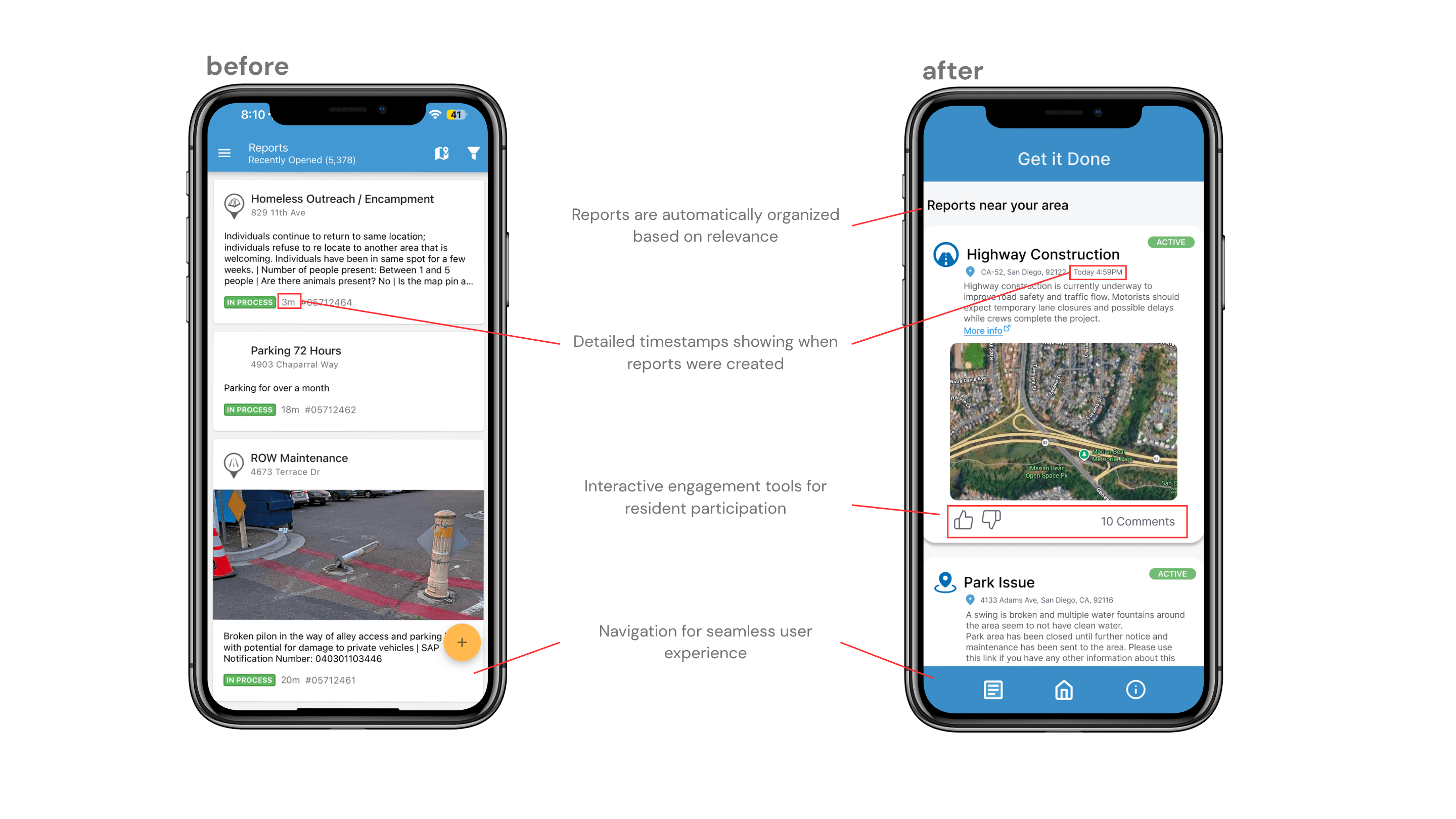
The original reports view is a dense text list. Each report is readable, but nothing visual anchors your attention, and there's no mechanism to signal that other residents care about the same issues. The revised version introduces image-forward cards sorted by relevance, detailed timestamps, and engagement tools — a like button and comment count — directly on each card. The reasoning connects back to what Gael said in the initial interviews: the app needs to feel less like a government form. The card format is how every social platform a teenager already uses presents information. Making the feed feel familiar makes it easier to get started.
The engagement layer does more than the visual work. When a student can see that a pothole near her school has been upvoted forty times, she has evidence that other people noticed it too. That social proof is part of what makes reporting feel worth doing — and it gives the city a clearer signal about which issues the community keeps surfacing.
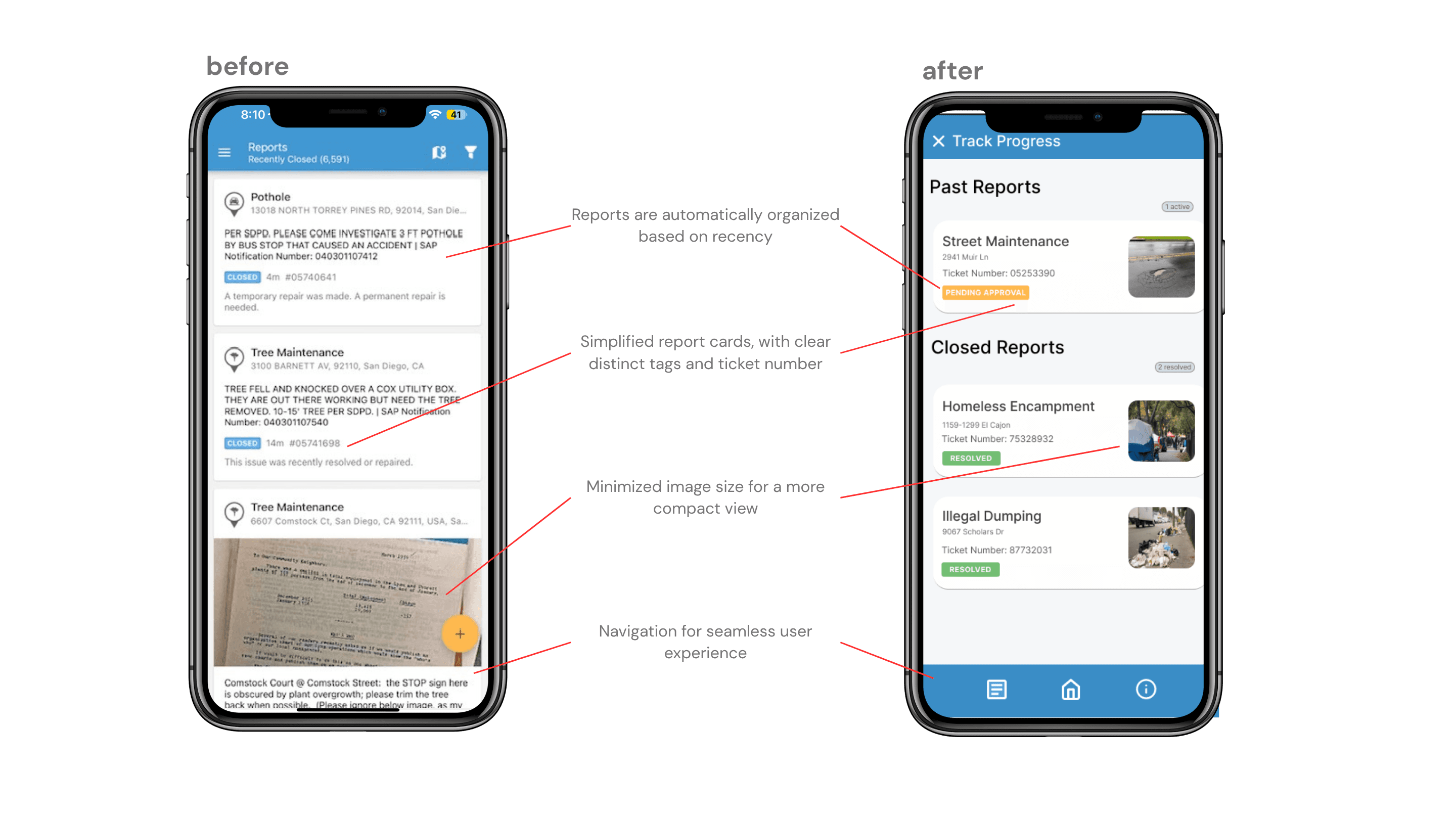
The original track progress screen is another undifferentiated list. Past and closed reports sit together with no visual distinction, and the cards carry more text than they need to. The revised version organizes reports into two explicit categories — Past Reports and Closed Reports — with cleaner cards that show ticket numbers and smaller thumbnails. The reduction in image size isn't just aesthetic; it makes the view more scannable, which matters when a student is checking back on something they reported weeks ago.
The category split is the more important change. Sol asked for this during the initial interviews — he specifically wanted to see what was finished, not just what had been reported. Separating closed reports into their own section makes the outcome of reporting visible in a way the original view doesn't. That's the feedback loop the app currently lacks: you submit something, and eventually it disappears into the same list it always lived in. The revised view makes resolution a distinct state, which is the first step toward making the act of reporting feel like it has a payoff.
High-Fidelity Prototypes
These screens extend Get It Done's existing mobile app with three features that came directly out of the interviews: a community feed, an upvote layer on the submission flow, and a status timeline. The goal wasn't to redesign the app. It was to answer the specific thing Kriselda asked — if they're not being reassured, what's the point of reporting anything?
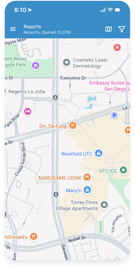
The community feed was the feature most of the interviewees described without being asked. Gael said it should feel more like TikTok. Daniel wanted a feed. Sol wanted to see what was finished. They were all pointing at the same thing: the current app submits to a void. You take a photo, you send it, and nothing connects your report to the broader community or to the eventual outcome.
The feed is designed to surface nearby issues, show how many people have reported the same thing, and update as the city responds. The intent is to give a student a reason to open the app even when they aren't reporting something — and to let them see, over time, that reports actually lead to fixes. That visibility is the reassurance Kriselda was asking for.
Adding upvotes changed the job of the submission form. In the original app, each report is discrete — you submit something and it enters a queue with no connection to anyone else who saw the same broken curb. The upvote layer means the form needs to surface whether you're submitting something new or whether a hundred people have already reported it.
That changes the form from data entry to community verification. When Carlie sees that an issue she notices has been upvoted fifty times, she gets social proof that the problem is real and that other people care about it too. She also gets an easier way to participate: she doesn't need to take a photo and write a description if the issue already exists. She just adds her name to it.
We chose not to add rewards or a points system. Sol pointed this out during the interviews — people would just game the rewards. The goal isn't to pay students to care. The goal is to make sure that when they do care, the effort feels worth it.
Get It Done has a deliberate visual identity — functional, municipal, not trying to be a consumer product. The color palette, button treatments, and icon style in these screens are pulled from the existing app rather than invented from scratch. The goal was for these extensions to look like something the Get It Done team could plausibly ship, not a student redesign layered on top.
The one deliberate departure is the status timeline, which uses a vertical step indicator that the original app doesn't have. That was a conscious choice: the existing track-your-request view is minimal to the point of being opaque. The timeline needed to communicate progress more explicitly, because the whole point of building it was to close the loop that currently leaves submitters with no feedback at all.